Nook is an interior design brand specializing in vintage minimalistic luxury. The brand aims to create inviting spaces that evoke a sense of warmth, comfort, and sophistication through carefully curated design elements. The logo and visual identity will play a crucial role in communicating Nook’s values of timeless elegance and attention to detail.
The CPO (Club Photo Orsay) seeks a vibrant rebranding for its webpage, posters, exhibitions, and promotional material. The outdated logo needs a contemporary and sleek overhaul. As a lively and active local photo club with a small but engaged membership, the new design should encapsulate the essence of fun, accessibility, and inclusivity. The club, organizing events like exhibitions, workshops, and outdoor shoots, welcomes photography enthusiasts of all levels. The goal is to create a fresh and inviting identity that resonates with the local community’s hobbyist and amateur photographers.
Target audience: everyone
Values: hobby, local, accessible to anyone, amateurs.
My approach: I opted for a wordmark logo as requested, incorporating gradients to infuse a sleek, fresh, and professional aesthetic. The versatile black and white palette ensures adaptability for various printing materials. Notably, the ‘O’ in the logo is shaped as a camera diaphragm, serving as a subtle yet clear nod to the club’s photography focus, even for those unfamiliar with its nature.
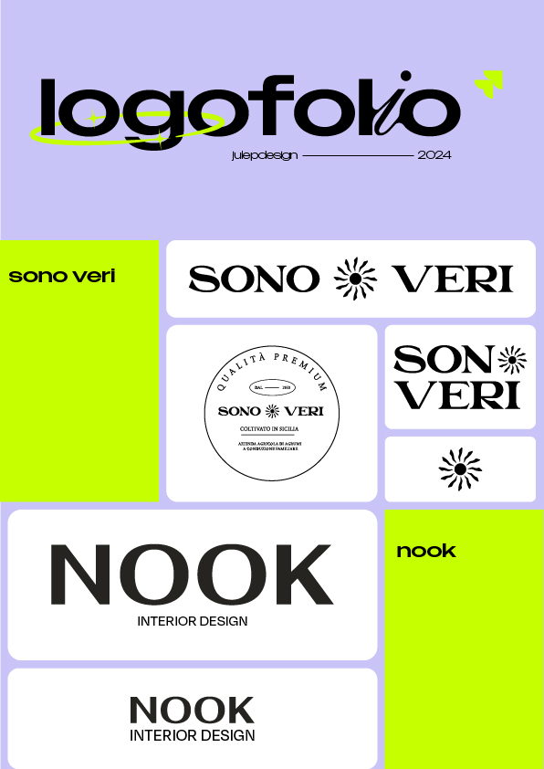
A family-owned Sicilian citrus farm, with a long-standing history in the region, is seeking to expand its business into the global market. To support this growth, the farm requires the development of a comprehensive brand identity that reflects its heritage and the high quality of its citrus products.
The project involves creating a versatile logo with multiple variations for different uses, alongside packaging materials that capture the essence of the brand. Additional design elements may also be needed to enhance the brand’s presence and appeal in international markets.
Key words
Global Reach / Heritage / Brand Expansion
Logo ↵
Mockups ↵
Visual identity ↵
milord
Milord – App for Sharing Food
Slogan:Join My Table Language: French App Focus: Milord is a platform designed to help individuals or restaurants share meals with students and others facing financial difficulties. The app will have two main features:
Mange à la maison: Where users can share home-cooked meals with those in need.
Ramène ton tup: Where users can offer takeaway meals for students or individuals who can’t stay for a full meal.
The name Milord is inspired by the famous Edith Piaf song, where the lyrics invite someone to “join the table,” symbolizing generosity and shared experiences.
Previous slide
Next slide
Target Audience:
Primary: Students in financial difficulty.
Secondary: People who want to help, local restaurants, and social organizations.
Values: Generosity / community / inclusion / kindness.
The branding needs to reflect the warmth and generosity of Milord’s mission. The app should have a friendly, approachable, and simple interface to encourage users to participate.
Key Visual Elements:
Logo Concept: The logo should evoke warmth and hospitality. Consider incorporating a hand and smile motif, symbolizing a welcoming gesture, kindness, and community spirit.
Colors: The palette should include warm, vibrant shades of orange to represent energy, kindness, and vitality, balanced with blue to represent trust, calmness, and reliability.
Imagery: Imagery should feel inviting, with visuals that convey togetherness, shared meals, and a supportive community.