Branding identity ↵
Full logo suite ↵
Mockups ↵
The brief:
The Pizza Factory is a brand-new pizza restaurant located in sunny Santa Monica! They’re offering a bunch of different pizzas, all with perfect crusts and amazing toppings! Looking for a visual identity to attract their target people and stand out against their competition.
Target audience:
My approach: The branding identity for Script Ed Market Bold Slant font is a vibrant fusion of playfulness and modernity.
The sans-serif font adds a sleek touch, appealing to the youth while maintaining a clean aesthetic. The hipster pizza slice mascot seamlessly integrates with Santa Monica’s lifestyle, embodying the spirit of casual beachgoers, skateboarders and rollerblading community.
Drawing inspiration from Italy’s flag, the color palette mirrors the pizza ingredients. With slightly darker tones, and distinguish Script Ed Bolt Market from competitors, injecting a refreshing vibe into the pizza market.
The brief:
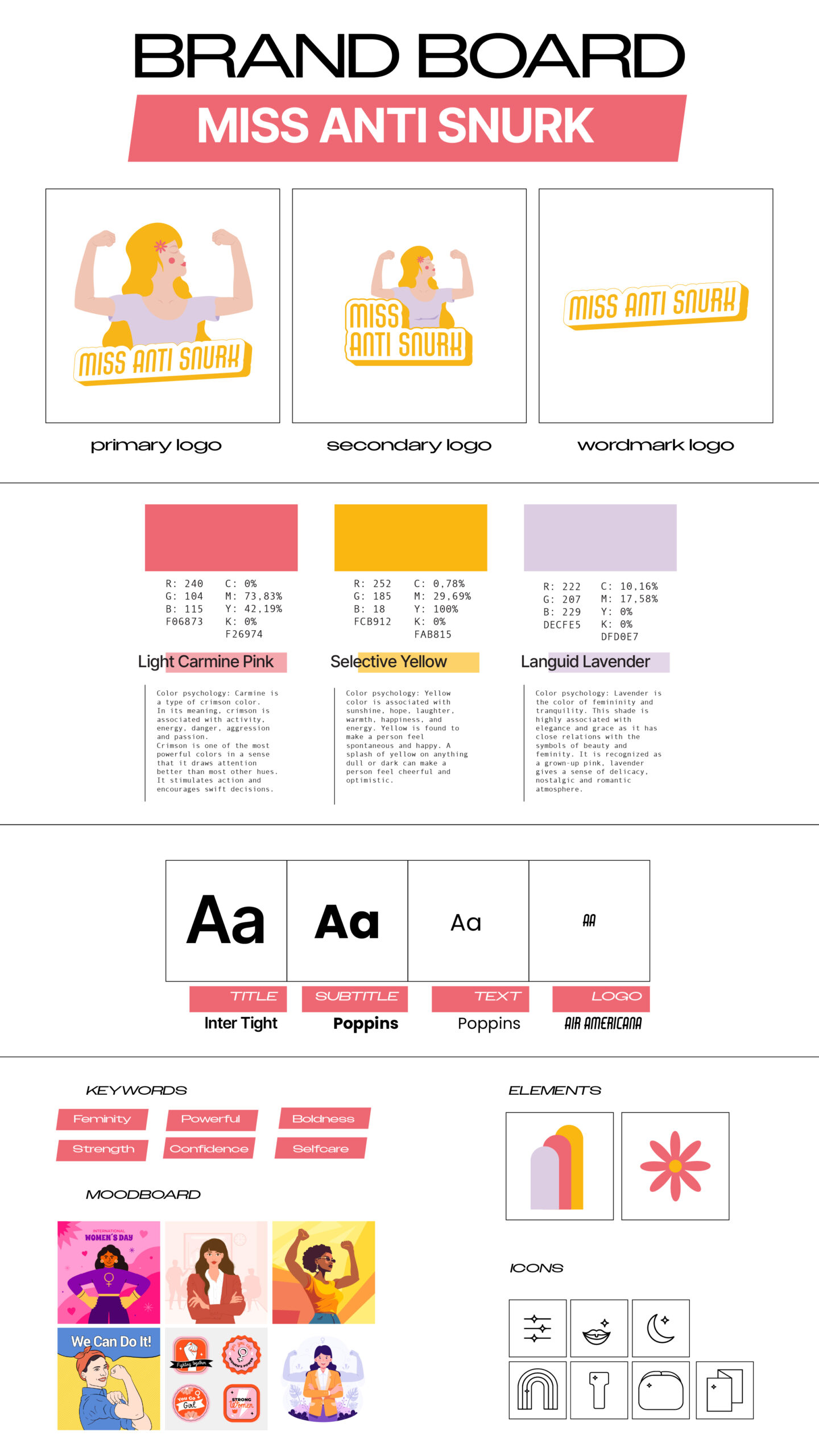
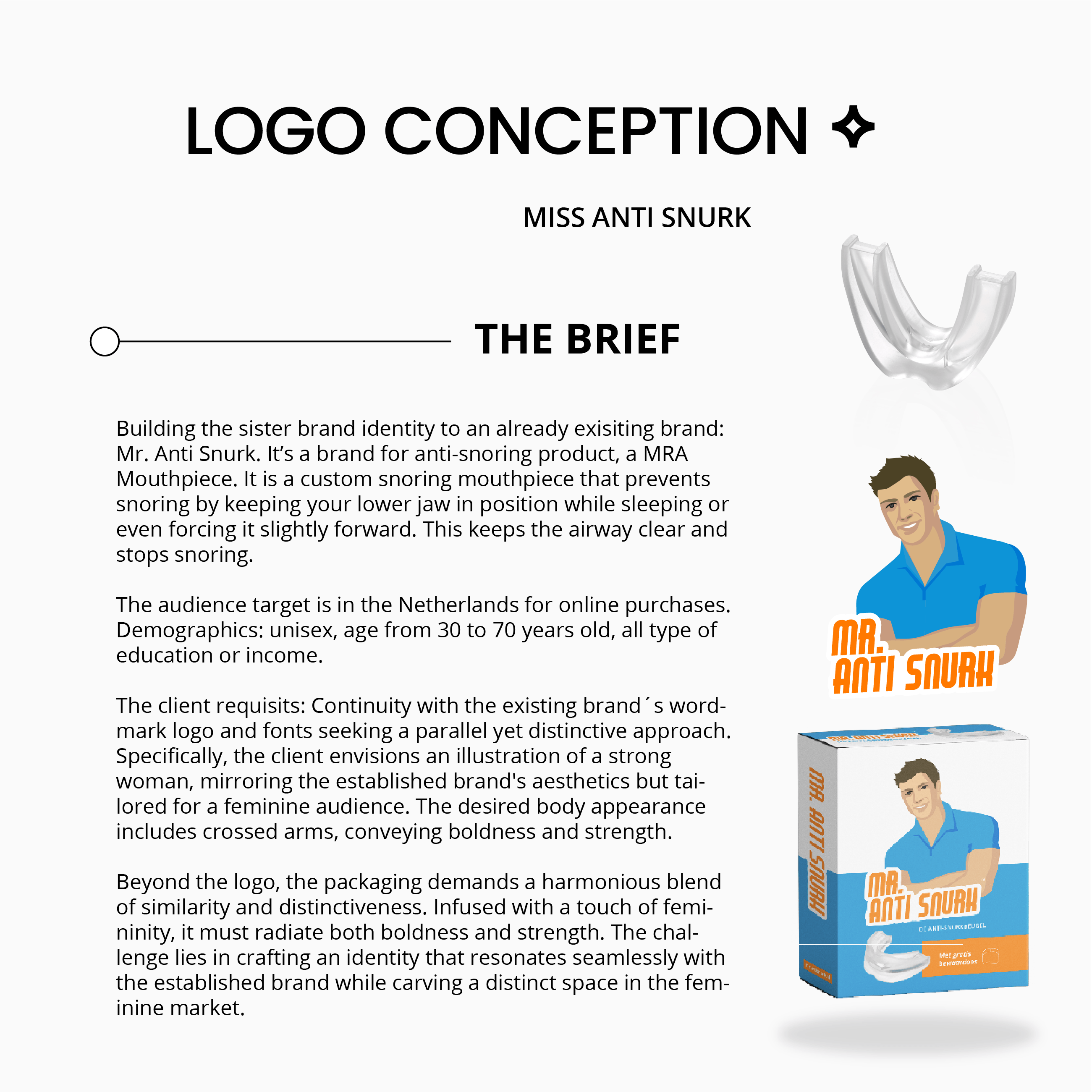
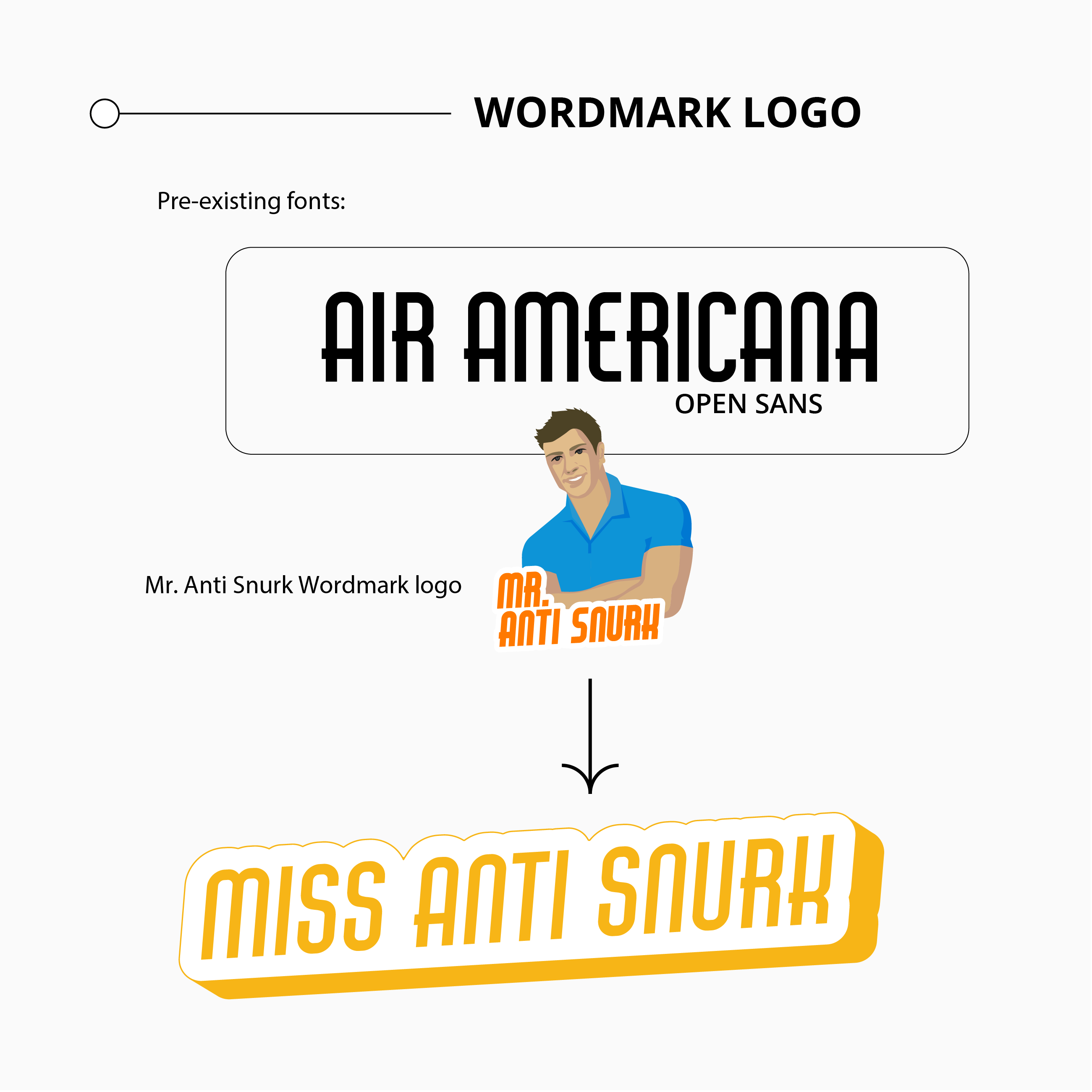
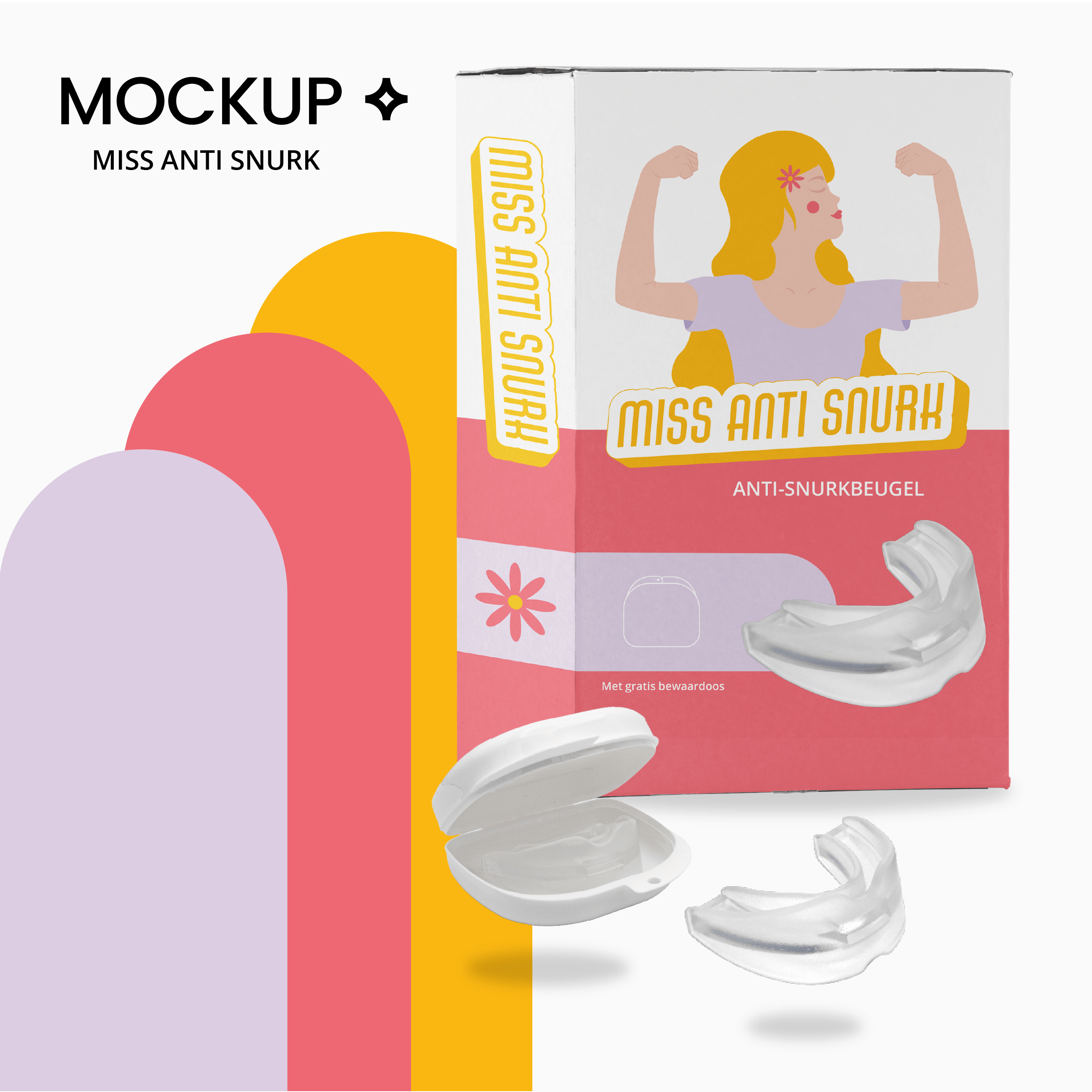
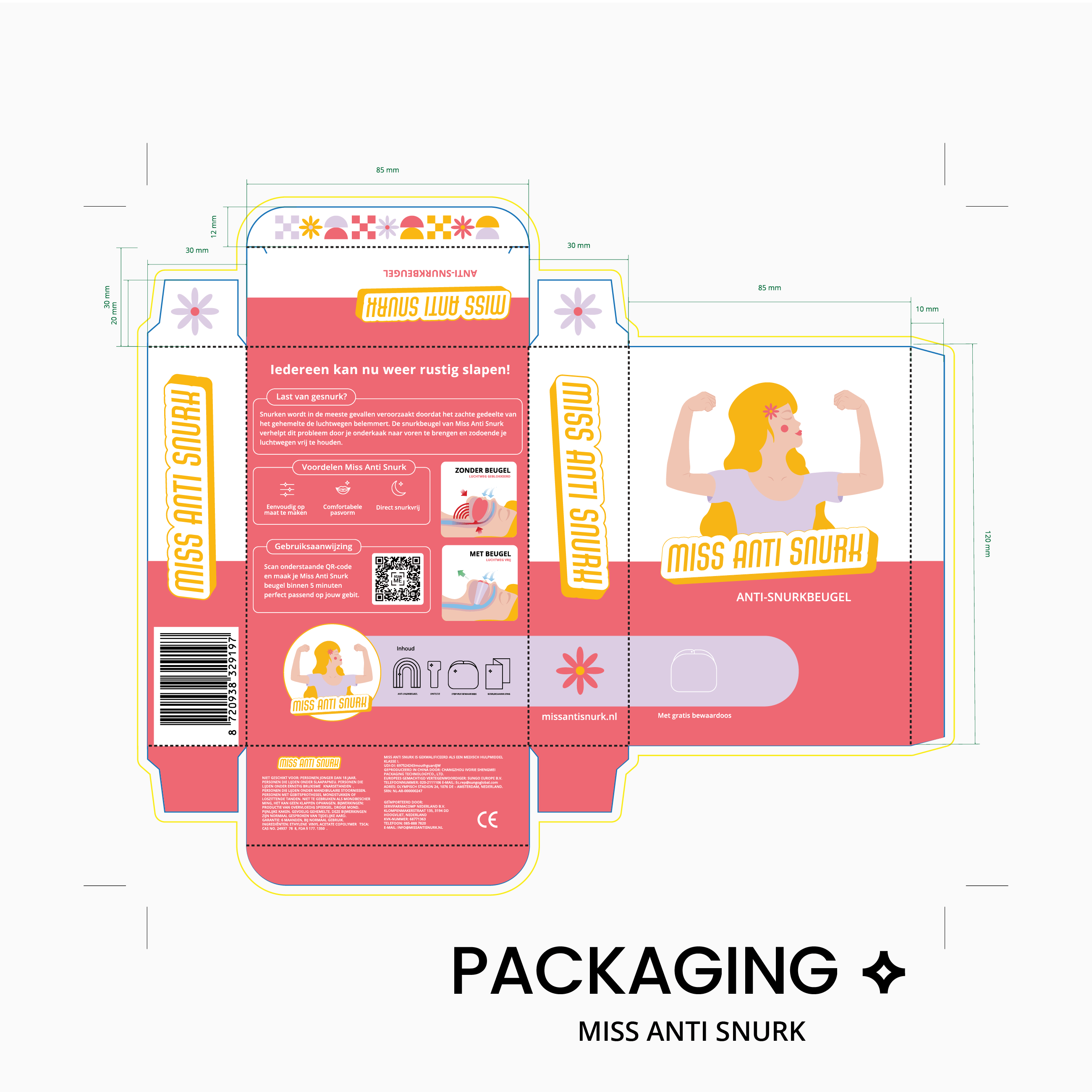
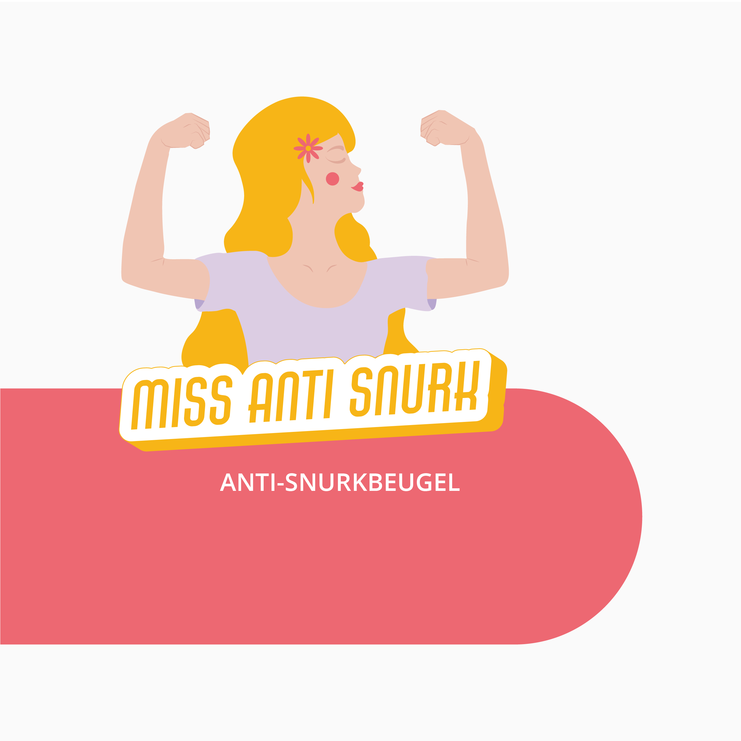
Building the sister brand identity of an already existing brand of anti-snoring mouthpiece device: Mr Anti Snurk.
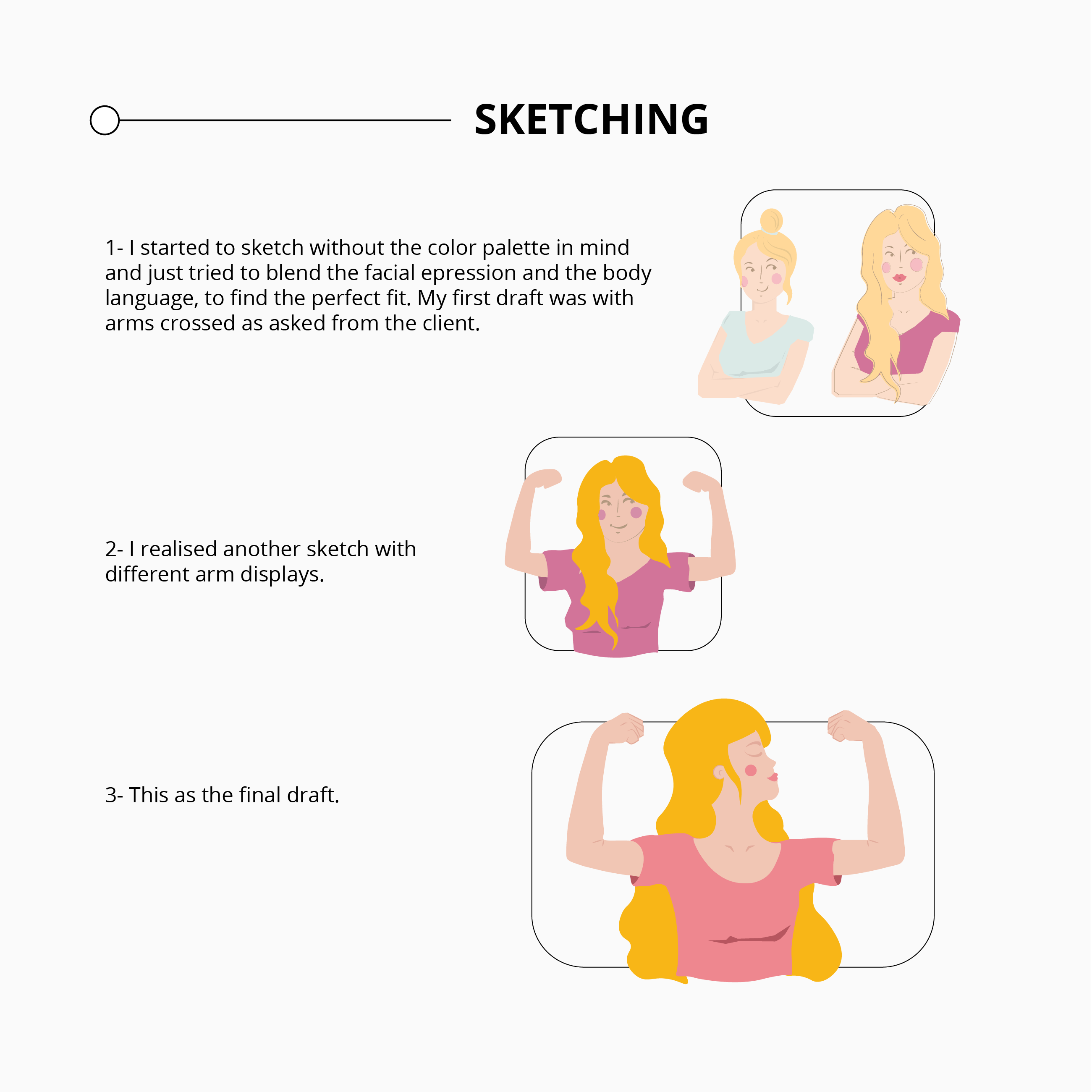
Requisites: continuity with the existing brand’s wordmark logo and fonts, seeking a parallel yet distinctive feminine approach. The client envisions an illustration of a strong woman, mirroring the established brand’s aesthetics but tailored for a feminine audience. The desired body appearance includes crossed arms, conveying boldness and strength.
Beyond the logo, the packaging demands a harmonious blend of similarity and distinctiveness. Infused with a touch of feminity. The challenge lies in crafting an identity that resonates seamlessly with the established brand while carving a distinct space in the feminine market.
Target audience:
Age: 30-70 years old / ♀ women
Location: Netherlands
Media: online purchases
Values: feminity, boldness and wellness
Branding Identity ↵
Full logo suite ↵
Icon set ↵
Packaging ↵
Mockups ↵
Infographics
Webdesign ↵
Tulmans, a family-owned business specializing in custom-made furniture, is looking to refresh its brand identity as it continues to grow. The project involves creating a new logo with variations, developing a modern and cohesive color palette, and designing a web mockup that aligns with their craftsmanship and high-quality offerings. The goal is to enhance their online presence and communicate their commitment to quality, craftsmanship, and customer satisfaction.
Keywords: Rebranding / Craftsmanship / Modernization
Rebranding ↵
Simple Logo ↵
Color palette ↵
Webdesign mockup ↵
ICON SET ↵