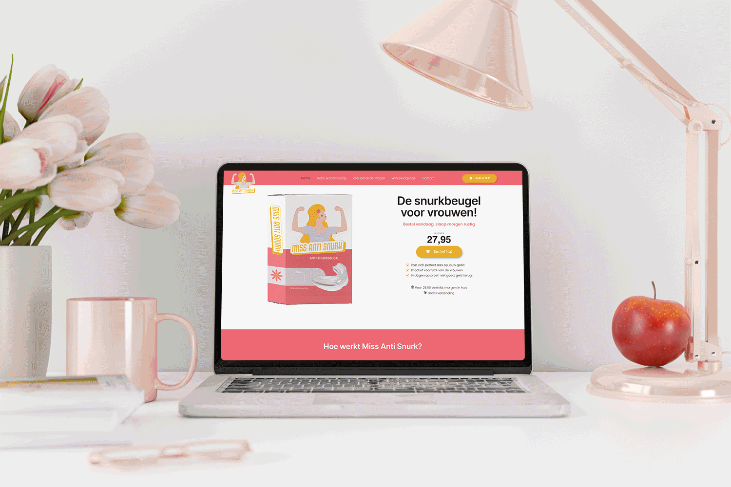
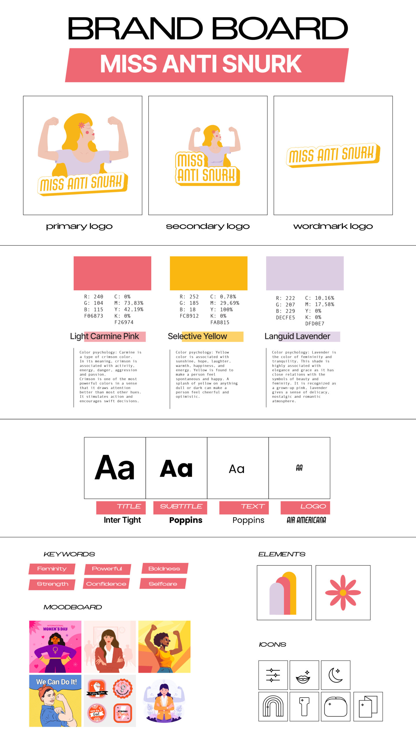
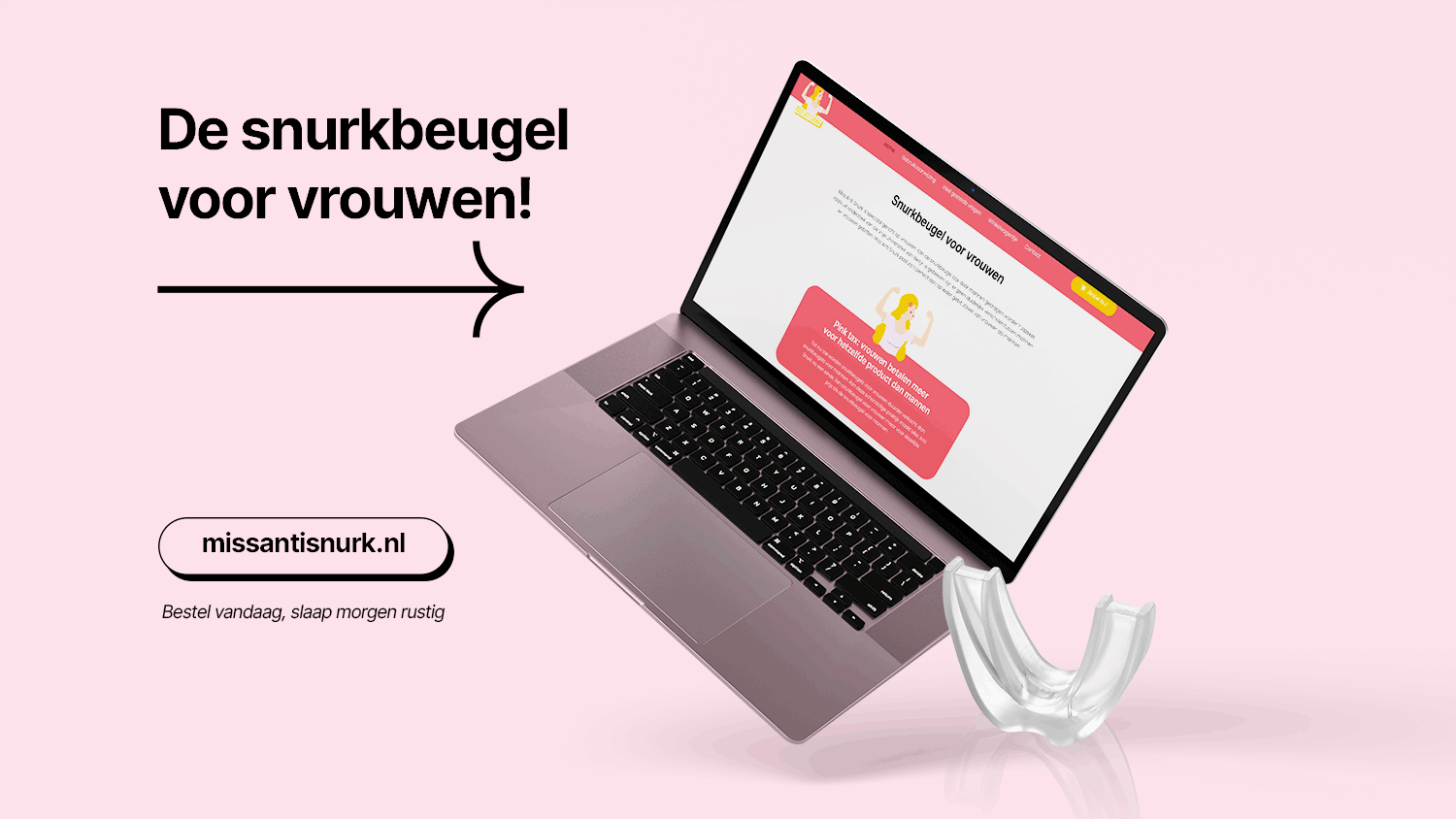
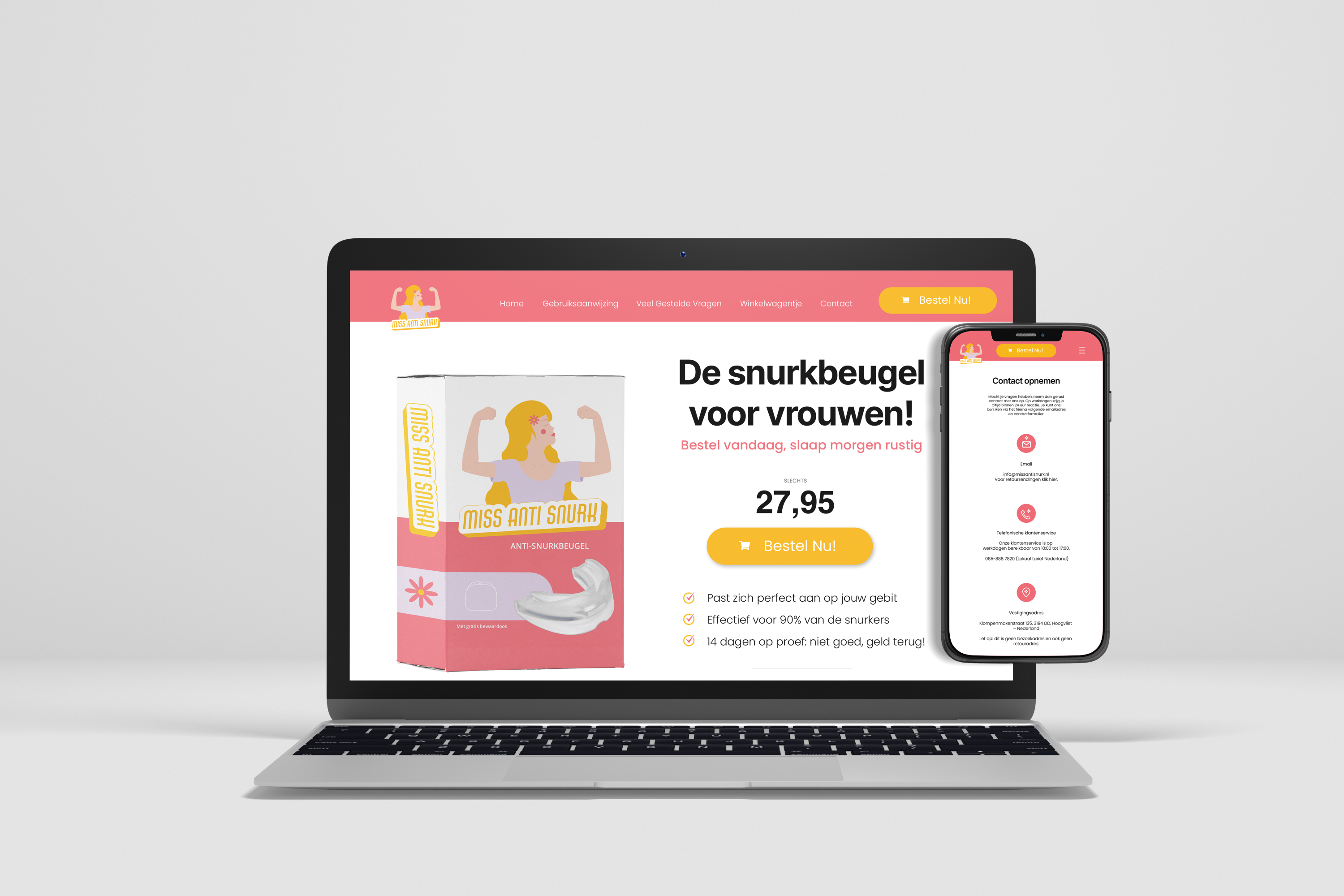
Building the sister brand identity of an already existing brand of anti-snoring mouthpiece device: Mr Anti Snurk.
Requisites: continuity with the existing brand’s wordmark logo and fonts, seeking a parallel yet distinctive feminine approach. The client envisions an illustration of a strong woman, mirroring the established brand’s aesthetics but tailored for a feminine audience. The desired body appearance includes crossed arms, conveying boldness and strength.
Beyond the logo, the packaging demands a harmonious blend of similarity and distinctiveness. Infused with a touch of feminity. The challenge lies in crafting an identity that resonates seamlessly with the established brand while carving a distinct space in the feminine market.